Studying art can be like diving headfirst into a waterfall with no idea on how to swim. It’s absolutely overwhelming to see the number of topics we have to understand and we can barely keep our head above water.
This is where studying from the masters can help! Master artists have already solved the problems in their images and have laid the answers out right in front of us. We just need to know how to find them and use them in our artwork.
I want to give you a step by step approach on studying from the masters and how to strip any image down to its bare bones to learn what makes the image so powerful. Then we can apply the same concepts to our own artwork and completely elevate our skillset!
Step by Step Guide to Master Studies
I will show you each step of the process using 2 examples:
- a more traditional piece by JC Leyendecker
- a modern painting of concept art from the Dreamworks film The Croods


Mood
The mood refers to how the audience feels when they look at the image.
ANALYSING THE MOOD
- Ask yourself what is the mood of the piece?
- Use at least one or two words to describe the emotional tone. This is completely subjective but oftentimes, a well designed image elicits the same emotion from different people.

The story moment above makes me feel tense and anxious since it’s obvious the characters are in a rush to get away from something, but the lighting is bright and hopeful.
These two elements contradict each other and balances out to sort of an eerie calm before disaster strikes.

Here in the painting by JC Leyendecker, it is obviously all about luxury and class.
In all honesty, when I saw this image I felt poor haha.
It was easy to feel inferior since the characters were so clearly out of my social league and were quite literally looking down at me.
Focal Points
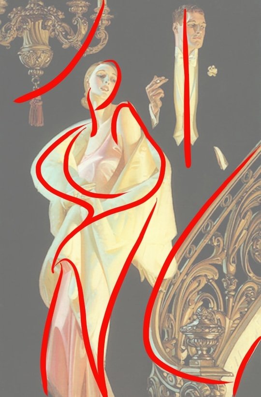
Focal points are where you want the viewer to look. It is the main subject of the image. You can have multiple focal points depending on the purpose of your image.
ANALYSING THE FOCAL POINTS
- Identify the hierarchy of focal points.
- Circle the different focal points on the image and number them based on the order of importance.

In this concept art, the focal point is the main story moment.
The highest contrast is where the biggest character (the father) is trying to catch the other person (his son). This moment is clearly framed by the tree branches directly to the left (highlighted in green).
There is also a strong leading line (highlighted in yellow) that takes your eye straight to the main focal point.
The girl character (the daughter) is the secondary focal point. Her silhouette is clear and she has a lot of contrast as a dark shape on a light background.
The rest of the family members make up the third focal point. Compared to the first two focal points, the other characters are much smaller and have a lighter value.
Lastly, the large face makes the fourth focal point as it almost completely fades into the background.

In the Leyendecker image, the woman is the main focal point. She is close to center and her entire silhouette is extremely clear due to the contrast of the light colours on the dark background.
The man becomes the secondary focal point since he is closer to edge and much of his silhouette is lost.
The third focal point is the surrounding architecture. These elements are important to support the theme of luxury and wealth but are not meant to distract from the characters.
The architecture also frames the lady figure which further supports her as the main character.
Gesture
Gesture has to do with the rhythm of the elements in the picture, or how the viewer’s eyes can move across the image.
ANALYSING THE GESTURE
- Identify hidden continuous rhythms between the different elements.
- Relate the character of the gesture back to the mood. Eg. Lots of curvy smooth gesture indicate a friendly atmosphere whereas lots of straight angles could indicate drama and tension.

In the concept art image, there are lots of smooth curvy gestures, typical of a jungle environment. All of the gesture lines (highlighted in red) either lead to or frame the focal points. Even the characters are placed along a gesture (in green).

Here, the gestures mainly come from the figures. The female has many smooth elegant gestures typical of a feminine pose.
The male has a stable gesture and is basically a straight line.
The curvy gesture of the female and the straight gesture of the male contradict each other and it creates a nice contrast between the two poses.
The gesture of the architecture nicely frames the focal point, as mentioned before.
Balance
Balance is determined by the distribution of contrast. Contrast can come in many forms, such as value, shape, gesture, color and psychological.
ANALYSING THE BALANCE
- How is the balance designed in order to convey the mood? Eg. heavy elements all at the bottom may indicate sadness or symmetrically placed elements can be grand and epic.

Above, the balance of contrast is between the foreground tree on the left with the characters and faces on the right.
There is an extremely large foreground shape made up of tree trunks and leaves. It is high in value contrast (it is the largest darkest shape in the entire image) and scale contrast (compare the size of the characters with the size of the foreground).
The level of value and scale contrast give it a ‘weight’ that will balance with the characters on the right .
Even though the characters are much smaller than the foreground shape, they have a lot of ‘psychological’ contrast ; this just means that viewers tend to give people , especially faces, more importance than a huge tree trunk.
In fact, if the characters were any bigger, they could easily ‘outweigh’ the gigantic tree on the left.

The image consists of just 4 major elements, all of which are organized on diagonals.
The two architectural features balance each other as they are placed on opposite corners of the image and have a similar level of value, shape, colour and edge contrast.
The two figures are also placed in the center of the image on a diagonal.
Shapes
Shapes can be categorized using their size, origin and whether they are positive or negative.
- Size: can further be broken down into big, medium or small
- Origin: this refers to the shape DNA or whether the shape originated from a circle, triangle or rectangle or from a combination of these
- Positive or Negative: positive shapes refer to the subject matter itself whereas negative shapes is the space between the subject matter. For eg. in the painting by JC Leyendecker, the chandelier, staircase and the 2 figures are positive shapes and all of the black spaces are negative shapes.
ANALYSING THE SHAPES : PART 1
- On the image, mark out the distribution of big shapes, medium shapes and small shapes and how it supports the focal point. Also look at negative shapes.

In the picture above, you can see the big shapes in red outline, medium shapes in blue and small shapes in black.
Small shapes tend to have more visual activity and attract attention so they are normally placed around the focal point, as they are in the above example.
Big and medium shapes are framing the focal point and act as an area of rest for the eye.

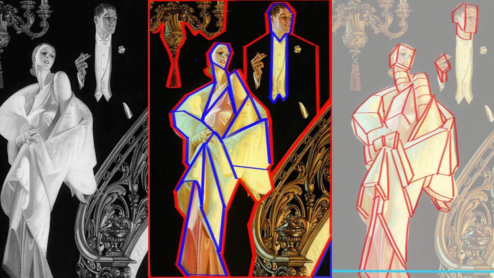
In the JC Leyendecker example, big shapes are red, medium shapes are blue and small shapes are cyan.
The two big shapes of the architecture frame the figures.
The two figures are two big shapes that are further broken down into medium shapes and small shapes with the small ones being concentrated at the face and hands.
It is important to note that the medium shapes for the female character are mostly angluar and point up towards her face, which is the main focal point of the entire image.

NOTE
The architectural elements have a lot of small shapes even though they are not the focal point.
What is happening here?
Didn’t I say earlier that small shapes tend to be concentrated around the focal point?
In this case, the detail on the architecture is added in order to balance out the figures.
If the architecture were just big and medium shapes, the image would feel empty. You can see it in this crude paintover.
Something about the picture just feels off and its a matter of balance.
ANALYSING THE SHAPES: PART 2
- On a separate canvas, block out the basic shapes with line. Identify the most common shape DNA to the least common.
- Determine if the contrast in the shape DNA throughout the image helped in prioritising the focal points.

For this image, the contrast in shape DNA wasn’t as obvious to me as it was for the Leyendecker image below.
But I realised there seemed to be a transition of large curved shapes on the left to more angular shapes in the middle to straights on the right.
Angular shapes and straights tend to show action and tension which supports the suspenseful mood of the image since the characters seem to be frantically running away from something.

The female clothing consists of mainly triangular shapes and her figure (shoulder and head) are made up of round shapes.
The contrast of both hard edged shapes and rounded shapes creates a lot of dynamism, or visual energy and movement.
The female figure feels alive since there is so much energy in the shapes.
In other words, it’s extremely interesting for the viewer when the artist plays two opposites against each other.
Having the same type of shape through the entire figure can be boring.
For the male, he is mainly rectangular shapes which symbolizes stability, typical for a male character.
The architectural elements are largely swirling shapes which create an elegant and luxurious setting.
Perspective
Perspective can be categorised based on the number of vanishing points. The most commonly known are one point, two point and three point perspective.
How you set up the perspective in the image can largely impact the mood.
For example, if the horizon line is above the image and we are looking down at a character, then we might feel that the character is inferior to us.
ANALYSING THE PERSPECTIVE
- Mark the horizon line and note the type of perspective used. How did they utilise the perspective for the mood?
- On a separate canvas, draw out a simple perspective grid and block in basic forms in geometric volumes

For the Croods image, it was complex because of all of the twisting shapes in perspective but taking each form separately and breaking down makes it much easier.
Tip: If a form can be drawn as both a box and cylinder, draw it as a box. A box will give you much more volumetric information than a cylinder.
A box has clear top, side and bottom planes and is much easier to rotate in space than a cylinder.
You can see above that our horizon line (in cyan) is closer to the top. This allows us to have almost a bird’s eye view and see everything that is happening in the scene.
This puts the viewer at the same height as the creature in the background.
The horizon line also crosses the characters at the top strengthening them as a focal point.

For the Leyendecker image, as mentioned before in the Mood section, we are looking up at the characters since our horizon line (in cyan) is all the way at the bottom.
This makes the characters feel elite and powerful.
I used simple geometric volumes such as boxes and cylinders.
For the male character, his torso is straight on so there is almost no perspective for his body.
Value and Edge
The most important factor in driving the mood of an image is the value.
ANALYSING VALUE AND EDGE
- Turn the image to greyscale or do a value study to replicate the tonal message of the image using as few values as possible.
- Analyse how the value was designed to serve the purpose of the image.
- In the value study, note where hard edges and soft edges were used in favour of the focal point.

VALUE
In the Croods image, the highest amount of value contrast is used to silhouette the characters as a dark shape against a light background.
The strong value contrast also makes the poses extremely readable.
The mysterious character in the background has a very low value contrast and almost blends in entirely. This is due to atmospheric perspective and it gives us a sense of the grand scale of this creature.
The entire left third is a simple dark value shape. This large shape frames the focal point and prevents the viewer from getting distracted in unimportant areas of the image.
The value design in this image is largely based on atmosphere with the foreground dark and objects getting lighter and lighter as the distance increases.

EDGE
In the Croods image, the highest concentration of hard edges are of course used at the focal point (in red) and the soft edges increase towards the periphery of the image.
Soft edges are also used in the foreground blur (the leaves in the upper left) and in the tree branches in the distance. This gives a sense of space and lets the viewer know that the image spans a great distance.

VALUE
In the Leyendecker image, the female character reads very clearly as a light silhouette against a dark background.
Her entire silhouette is visible as opposed to the male character that only has his inner shirt, face and hands read as silhouettes.
EDGE
Each element is silhouetted with hard edges and has soft edges within the shape.
Soft edges are largely used to describe form as opposed to the Croods image that used soft edges to show distance.
Colour
Colour design has a strong relationship with the mood and image. For eg. light and warm colours feel positive and dark and cold colours feel negative. Or specific hue combinations can elicit different emotions.
ANALYSING THE COLOUR
- Note the dominant colours and their relation to the mood.

In the Croods image, the colours are largely warm and natural colours which are yellows, greens and oranges.
This clearly helps show the jungle setting and sets the stage for the characters. The warmest part of the entire image is where the light shines through the tree trunk right onto the main characters.

The Leyendecker image is largely warm colours with a bright warm underlight and a cool top light.
The warm vs cool gives a colour richness as the complementary colours play off each other.
The warm underlight makes it seem like the couple are entering a grand party waiting below them and the cool top light creates the feeling of large windows or a glass ceiling.
Both of these concepts point to a luxurious lifestyle which is what we established earlier in the mood section.
The highest amount of saturation is in the female’s dress which again supports her as the main character.
In conclusion…
A master artist puts an immense amount of thought into every corner of their image. And it’s up to us to learn from their decisions and try to implement our newfound knowledge in our own artwork.
CAUTION:
While, it’s important to study from the masters, it’s equally important to experiment and discover things on our own. Don’t get caught up with analysing other’s work and trying to match their decisions.
Take the time out to enjoy the process of uncovering new ideas in your own art!


Wow this is so detailed! :O